So this is my final blog post for this project :(, as it has come to an end after a very intense and pressure filled past few months. I have had great fun with the project and it has allowed me to push myself to the absolute limits in relation to using and developing a media mind frame.
So it is time for me to stop there and say I hope you like the pieces I have produced and that I get a good mark as I beleive I have worked hard throughout the project.
Byee,
Megi x
Saturday, 5 February 2011

Thursday, 3 February 2011
A2 Evaluation
This is my final evaluation for my A2 coursework, as you can see I have used prezi and camtasia for this as I wanted to make it a little more intresting visually and also through audio instead of all written.
Wednesday, 2 February 2011
File Conversion? !!
I decided to do all of my A2 presentation through camtasia and prezi to help guide to and from the different sections of the evaluation. Now that I have done this however, I was a little stuck on how I would convert the file from a camtasia file to a avi. one so I could upload onto youtube etc.
I therefore conducted some research, and found this incredibly useful tutorial about exactly what I needed and it has worked - thanks to youtube sharing of knowledge :)
I therefore conducted some research, and found this incredibly useful tutorial about exactly what I needed and it has worked - thanks to youtube sharing of knowledge :)
Saturday, 29 January 2011
Evaluation Prep: Technologies
How did you use new media technologies in the construction and research, planning and evaluation stages?
In order to answer the last question properly which is about the way I used technologies I will need to show what I have used and in which stages I have done so. I therefore decided to create one large image putting in all of the different logos of the programmes I have learnt which I will talk through separately in the evaluation. The programmes here are:
In order to answer the last question properly which is about the way I used technologies I will need to show what I have used and in which stages I have done so. I therefore decided to create one large image putting in all of the different logos of the programmes I have learnt which I will talk through separately in the evaluation. The programmes here are:
- Blogger (Pre production, research stages)
- Premier (Post production)
- Prezi (Evaluation)
- Camtasia (Evaluation)
- Vimeo (post production)
- Photoshop (all stages)
- Wordle (Evaluation)
- Facebook (Evaluation, feedback)
 |
| Different Technologies Used |
Wednesday, 26 January 2011
Evaluation Prep: Feedback
What have you learned from your audience feedback?
I am currently building up my evaluation material so that I can make one final document answering all of the questions. However, for this I have to ensure that I build up all of the different materials I will include within the evaluation to answer the questions. Now thatI have created my final pieces, I will need to collect feedback on what people thought of the video and the ancillary tasks I produced. I have decided to collect different types of feedback and from different types of people because I wanted to see if it was similar points of improvement they would suggest or different ones.
Audio Feedback:
The two video clips below, are of two different age groups so I can see if the improvements they suggest vary because of their ages or if it is an overall issue everoyne picked up on.
Age Range: 16-24yrs
Age Range: 40-50yr
As I can see from the two feedbacks above, they both reccomend simila improvements mainly being more locations in the video. This is therefore one of the main things I have learnt from the feedback and will go into further depth within the evaluation.
Electronic Feedback:
I also collected electronic feedback from different people, as can be seen below to vary which feedback I take.
Teacher Feedback
 |
| Teacher Feedback: Twitter |
External Feedback
 |
| External Feedback: Youtube |
Peer Feedback
 |
| Peer Feedback: Blogger |
Monday, 24 January 2011
Evaluation Prep: Video and Ancillary Combination
How effective is the combination of your main product and ancillary texts?
In order to answer this question fully I have decided that I would gather all of the peices I have produced and input them into prezi and talk through the ways in which I combined and used parts from each of them to interlink them together. The main ways in which I combined them was through:


In order to answer this question fully I have decided that I would gather all of the peices I have produced and input them into prezi and talk through the ways in which I combined and used parts from each of them to interlink them together. The main ways in which I combined them was through:
- Bold Colours- I used pink for the background within the ancillaries, whilst in the video there was a lot of pink lighting which ensured that I used lighting and colour to combine the two.
- Bold Moves- Positions used within the video of the three girls were quite big as the dancing was very high energy. I also used bold moves within the poses I took of each girl in order to develop on these ideas.
- Positioning- in the video all three of the girls have been placed in a row to show them all in a frontal position. In the ancillaries I have also placed them in a row of three, looking out whilst the one in the middle is facing the front.


Saturday, 22 January 2011
Evaluation Prep: Nine Frame Analysis
In what ways does your media product use, develop or challenge forms and conventions of real media products?
To answer question number one, I have created two nine frame analysis in order to answer what I have learnt from the conventions. The first is of existing music videos and different shots within them and the second is of my own using similar shots from what I had learnt from existing ones.
To answer question number one, I have created two nine frame analysis in order to answer what I have learnt from the conventions. The first is of existing music videos and different shots within them and the second is of my own using similar shots from what I had learnt from existing ones.
 |
| Real Music Videos |
 |
| My own music video |
Thursday, 20 January 2011
Camtasia Tutorial
I have decided to produce parts of my evaluation using camtasia as this will allow me to project what I see in my screen to the audience making it look better visually and moving away from the usual forms an evaluation is presented. however, before I can start on this I will need to know how to use some of the more complicated parts of it therefore I have watched tutorials such as the one below to understand the technology a little better.
Wednesday, 19 January 2011
Evaluation Decisions
So now I am reaching the end part of my coursework and this is the evaluation stages of my final product. However there are a number of ways in which I can do this, my options are:
- Written in blog
- Prezi (same approach as AS)
- Camtasia (Never used before :S)
- Camtasia & Prezi (a lot of preparation needed, but better chance of obtaining mark)
Tuesday, 18 January 2011
Sidney Stringer Media: Evaluation - Finally!
Sidney Stringer Media: Evaluation - Finally!: "These are the four questions which you need to address for the last 20 marks of the project, for evaluation. As with the film opening earli..."
Thursday, 13 January 2011
Album Poster- My Oppinion
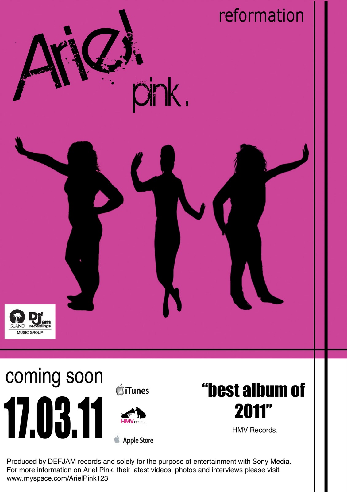
Now that I have finished my album poster I am happy with the final design as it looks the way I planned it to look in the earlier stages of my project. I like the front cover of the album because of the bold colour and the silhouettes therefore the album poster mainly consists of this.
I also think the company logos and small print I have included within it along with the font works well and it looks quite real which was very important for me to achieve.
I also think the company logos and small print I have included within it along with the font works well and it looks quite real which was very important for me to achieve.
Sunday, 9 January 2011
Friday, 7 January 2011
Wednesday, 5 January 2011

Tuesday, 28 December 2010
Magazine Poster: Conventions
From the research I conducted, I identified the main conventions of a magazine poster as they all use common features with small differences. These conventions are:
- bold image- this includes using a bold image of the artist/artists to make them instantly recognisable to the target audience.
- large text- they also use large fonts in order to make the aldbum look attractive but again eye catching as this is a marketing technique.
- minimal writing- too much writing draws attention away from the main image, therefore it is better to use less writing and focus more on the image.
- stand out box- they also use a stand out box to draw out something which is a bonus feature of the disk again to attract customers into buying it.
- small logos- the logos used to show where the cd can be bought from are small in order to ensure they arent the focal point.
- strong colours- the colours used on the cd itself are portrayed into the poster to set a houstyle. the bolder the colour the better to draw attention to it and to ensure it stands out.
- silhouettes- there are also bits tht have been sihouetted in Rihanna's album to add texture to the image and again make it the point of focus.
Tuesday, 21 December 2010
Magazine Poster: Research
This album poster is quite plain as it only uses soft colours such as baby blue and beige. It has been produced to look like a notepad drawing, as the border on the side resembles this. This is a nice effect, however it is not very attractive as the colours arent eye grabbing. The text on the poster is quite large and minimal amount of writing has been included to ensure people looking at the advert are only focusing on the name of the artist and title of the album. The large image of Neyo is also eye grabbing as it attracts all of his fans and people are instantly aware of which artist this is, which again adds to the eye catching features of it. Furthermore, there is a small bubble with a song feature on the album, this is used as a marketing technigque as it is making the audience think they are getting a bonus inside the CD, therefore used as an attracting audiences mechanism. The way in which this has informed the production of my own poster, is that I am aware I will need to include a bonus like feature on the cover as it is an advertising tool to serve the purpose of the poster.

This poster is very different to the previous one as it is much more bold and stands out at it uses a large image of Rihanna striking a very dramatic pose. This is unconventional of her genre, as it is RNB yet she has used many gothic connotations varying from the excessive use of black colour all around the poster but also her make up is very heavy and gothic. I think this was created to ensue people were aware of the album and to attract the audience immediately as the bold colour draws attention to this making it stand out. The graphics use don the bottom, showing the logos of where the CD can be bought or downloaded have been made much smaller as they are not the focal point. Overall, this has informed my own poster design, as it has made me more aware that bolder colours are better and black almost silhouette images draw attention to the poster.

The poster shown below, is from a pop genre style music and Gwen Stefani's album poster. This is very different to the two previous ones shown mainly due to the colours it uses. The colours are extremely bright mainly consisting of yellow and red almost creating a carousel theme to the album. This carousel theme is also shown in one of her videos, therefore showing the link here. Also. there is a large image of Gwen posing in a very dramatic way, again a common feature to ensure the audience is immediately aware of the artist. Agsin the logo of the stores its available at have been placed at the bottom as they are not the focal point.


Saturday, 18 December 2010
Draft Three- Digipack Front Cover
This is my third and final draft version of the front cover in my digipack:
As can be seen, I have taken away the blocks of colour and just put one large block behind all three picture because I wanted the colour to stand out evenmore, However I do not think this makes a large change, therefore this final draft has led me to putting the shocking pink colour behind the whole of the cover for maximum emphasis.
 |
| third draft of front cover |
Thursday, 16 December 2010
Draft Two - Digipack Front Cover
This is my second draft of the front cover of the album:
 |
| Second draft |
As can be seen from the draft of the fron cover above, I have incoporated colour into the background of the images and taken away the thick frames they had on the first try out. I think this looks a lot more appealing and the colour really represents the group as they are bubbly and very "in your face" therefore the shocking pink colour represents them well I think.
I still think however, that it may benefit from a little more colour so it is even more bright and attracts the audience straight away, however it is an improvement from the first draft.
Wednesday, 15 December 2010
Draft One - Digipack Front Page
Now that my images are ready to be put into the digipack, I have experimented the different styles I would want for the front cover. This is my first draft of the front page:
This is the first design I created after manipulating the images and selecting the main colours I would use. As can be seen from above, I have also edited a pink nail varnish bottle to create an effect as if it is tilting over the frame and tipping onto the item which I think works quite well.
However, due to the lack of background colour I do think it looks a little dull and not as eye catching as I want it to be therefore I am going to try and change the background so it looks a little more fitting to the genre.
 |
| First draft of front cover |
This is the first design I created after manipulating the images and selecting the main colours I would use. As can be seen from above, I have also edited a pink nail varnish bottle to create an effect as if it is tilting over the frame and tipping onto the item which I think works quite well.
However, due to the lack of background colour I do think it looks a little dull and not as eye catching as I want it to be therefore I am going to try and change the background so it looks a little more fitting to the genre.
Tuesday, 14 December 2010
Font Research
these are all of the different fonts I researched before choosing the final one I thought fitted best within the designs I laid out for my poster and digipack. I finally decided that I would chose the one entitled "Birth of a Hero" as it was the one I liked best and I think it will help my ancillary tasks to stand out.


Source: http://www.1001freefonts.com/


Source: http://www.1001freefonts.com/
Subscribe to:
Posts (Atom)