Heyyy Megiii :) I really like your advert!!!I love the way you have used the sillhouettes They look really effective I also like the colour pink that you have used, it looks just right. It isnt too brightI also like the font style that you have use However i do think that the name of the album 'Reformation' could be displayed in a better font it looks out of placeBut overall your advert looks really professional especially becuase you have added the small print and company logos :) Good job!
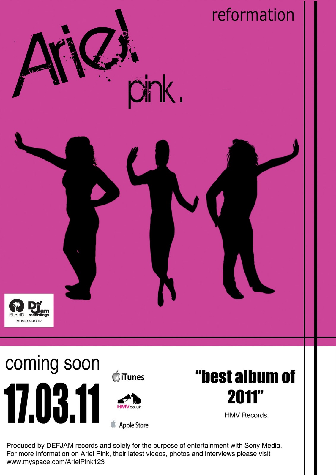
Heyyy Megiii :)
ReplyDeleteI really like your advert!!!
I love the way you have used the sillhouettes
They look really effective
I also like the colour pink that you have used, it looks just right. It isnt too bright
I also like the font style that you have use
However i do think that the name of the album 'Reformation' could be displayed in a better font it looks out of place
But overall your advert looks really professional especially becuase you have added the small print and company logos :) Good job!